Some fun data simulations I use to think about confounders and colliders

I love conducting very simple simulations and getting terrified by the implications of their results.

Let’s say you want to measure the association between the outcome that you care about, y, and your key predictor, x. You begin with a simple regression model, predicting y with x.

One of these estimates is correct (1), one is 35% smaller than it should be (2), one is about 80% larger than it should be (3). Let’s start with the smaller estimate (2). Below is the Stata code to set it up:

clear all
set obs 10000
* create a matrix to establish correlation of x and z
matrix C = (1,-.35\-.35,1) 
* simulate x and z, set correlation equal to -.3 (via matrix C)
corr2data x z , means(0 0) sd(1 1) corr(C)  n(10000)
twoway scatter x z
graph export s8811-02-simuation_lecture-02.emf, replace
gen y = 1 + x*1 + z*1 + rnormal(0,1)
reg y x
eststo m1
reg y z
eststo m2
reg y x z
eststo m3

esttab m1 m2 m3

Variables x and z are negatively correlated (-0.35, higher x, lower z). Both are positively correlated with y. So you just include x, or z, in your regression equation, you won’t get their actual association with y.

In (1) above, x is too small. In (2), z is too small. Both included in model, coefficient magnitudes increase to correct size. Let’s look at (3) now, which is a weird one.

cls
clear all
set obs 10000
* create a matrix to establish correlation of x and z's
matrix C = (1, .3 , .5 \ .3 ,1 , 0 \ .5 , 0 , 1)
* simulate x and z, set correlation equal to -.3 (via matrix C)
corr2data x z1 z2 , means(0 0 0) sd(1 1 1) corr(C)  n(10000)
corr x z1 z2
gen y = 1 + x*1 + z1*1 + z2*1 + rnormal(0,1)
reg y x
eststo m1
reg y x z1
eststo m2 
reg y x z2 
eststo m3 
reg y x z1 z2
eststo m4
esttab m1 m2 m3 m4

This setup is fun and weird. Now there isn’t just one confounding z variable. There are two! x, z1, and z2 are all positively correlated with one another. All have the same association with y, 1.

Without z1 or z2 in the regression model, x’s association with y is much too large! But including only z1 or z2 results in coefficients for x that are still much too large. It’s only when z1 and z2 are both included in the model that x’s coefficient is correctly reduced to 1. Even if your model is mostly correct (z1 or z2 in there), you’ll still get the wrong answer! This setup is fun, as you can let z2 affect all other variable, just pairs (x and y, x and z1, z1 and y), or just single variables (x only). You can also let the magnitude of associations and correlations vary to see how the magnitude and direction of bias vary.

Let’s look at example (1), where the coefficient for x=1. Below is the code to conduct this simulation.

cls 
clear all
set obs 10000 // set sample to 10,000 observations
gen x = rnormal(0,1)
gen y = x*1 + rnormal(0,1)
gen z = x*1 + y*1 + rnormal(0,1)
corr x z
reg y x
eststo m1
reg y z
eststo m2
reg y x z
eststo m3
esttab m1 m2 m3

Here, the correctly specified model just includes x (y is made only with x included and random noise, rnormal(0,1)). However, maybe you haven’t thought correctly about which variables to control for, and you notice that z has a positive association with y, and is also positively associated with x.

(Here we see a large positive correlation between z and x. Higher z, higher x).

In model (1), we see that x has a positive and significant association with y, with a coefficient of 1. In model (2), we see that z has a positive and significant association with y, with a coefficient of 0.5. When both z and x are included in the regression model, we see that z remains significant and positive with the coefficient magnitude unchanging. x, in contrast, loses significance and the coefficient goes to zero.

You may think to yourself, aha! Results in model (1) are not true, because z is a confounder. And when z is included in the regression model, x’s effect goes away. A concrete example: SAT scores predict college success. But both are caused by child socioeconomic origins. Control for that, and the association between SAT and college success declines.

BUT. I made the data. And I made model (1) the true effect of x on y. I ALSO made z to be a collider in this setup. x and y cause z. But z doesn’t cause y. Just as with the examples above, including z changes the association between x and y. But in this case, that change is inappropriate, whereas in the other cases, the change WAS appropriate. How do I know this? Because in this case I made the data. In cases where one doesn’t make their data for their research, the variation across these simulations should hopefully cause some sleepless nights as you fret over whether you correctly specified the theoretical model that guides your model specification.

Anyways, I thought this was neat. Hope it helps you!

I understand selection on the dependent variable, but I actually don't

When you conduct a research project, you must ensure that you don’t select on the dependent variable. Doing so will create a risk that you produce biased results. I’m thinking about this because I’m reading the excellent Thinking Clearly with Data: A Guide to Quantitative Reasoning and Analysis by Ethan Bueno de Mesquita and Anthony Fowler (BF).

Let’s list out three simple examples they use for selecting on the dependent variable.

  1. Malcom Gladwell’s 10,000 hours. Gladwell studied successful people and found they tended to invest 10,000 hours of practice into their craft. So…you do the same to be successful. But BF note that Gladwell doesn’t survey non-successful people. Perhaps you find the same rate of 10k hour investment among non-successful individuals as well. In that case, this practice investment is not predictive of success.

  2. School dropouts. The Gates Foundation studied high school dropouts and found that 70% of them found classes boring. So, make high school classes interesting to increase retention? Nope! A national study of high school aged individuals found roughly the same percentage of individuals who did, and did not, drop out found their classes boring.

  3. Terrorism. A study of suicide bombing found them to frequently occur in countries occupied by the US military. But these selected mostly on countries with terrorist attacks. Many countries have been occupied by the US military but not produced suicide bombers (Germany, South Korea, Japan, etc.).

So far so good. Don’t just study a restricted range of your DV. Got it.

…but I actually don’t got it.

This point also relates to issues of selection and conditioning on a collider. In the linked blog post, a spurious negative relationship between conscientiousness and IQ is found among college graduates because college attendance is positively correlated with both conscientiousness and IQ. So one could argue that by restricting the sample to college graduates, you’re partially selecting on the dependent variable (college graduates have slightly higher mean conscientiousness). I think that’s right.

Let’s go back to the HS dropout question.

We don’t want to select on those who drop out of HS because we won’t be able to see whether boredom correlates with the probability of dropping out. Makes sense. But at what point do we stop selecting on the dependent variable? If I’m willing to not thing about this question too much, the answer’s obvious. But when I think about it a bit more seriously, I get thoroughly confused.

We must include individuals who are not simply HS dropouts in our sample to understand the factors that associate with the probability of dropping out. So we include HS grads, perhaps by conducting a nationally representative study of, say, 17-25 year olds, and asking all folks about how boring they found their HS classes (BF found everyone was about equally bored). Easy peasy, lemon squeezy. But is that the only group we should account for?

Consider migration. Every year some number of children under the age of 18 leave the United States. It is highly unlikely the migratory children are representative of the distribution of all key observable and unobservable characteristics that may predict both dropping out of high school and whether a young person finds school classes boring. So a random sample of 18-year-olds who have not migrated probably has some amount of selection that confounds results, right?

Consider time. Why restrict your population to today? Many of the factors affecting high school attainment play out across multiple years, multiple decades. Are you selecting on the dependent variable if you select from a year with a disproportionate concentration of non-dropouts? Seems likely.

Consider non-respondents. Obviously not evenly distributed across dropouts and the overly bored.

What reason do we have to not get weirder? What about the deceased? I suspect less educated and more risk tolerant (or more easily bored) individuals are more likely to die at young ages. So wouldn’t their exclusion potentially introduce selection-based bias?

Let’s get even weirder. What about the potential humans, those trillions of zygotic potentialities who didn’t successfully make it to be a physical person and are thus excluded from our sample? Are you telling me the actualized people are a random selection from the broader potentialities? I’m not convinced. But then aren’t we again in a situation where selecting on the actual folks, potentially introducing bias in the association we care about, between HS completion and feeling bored in class? We care more about that association than the observed distribution of humans who won out the competition to be born, right?

I realize that some of these examples are silly. But when I think seriously about this topic, the potential problems introduced by the obvious examples and the ones by the sillier examples don’t feel so terribly distinct.

It seems that the typical response is to handwave and say something like, “think seriously about your question, “use your substantive knowledge of the case” or “be guided by theory.” But I’ve noticed that some of these subtler points of selection, identification, and causality don’t really respond well to arguments such as, “my theory suggests doing X.” Don’t the issues of selection, etc. also suggest that previous research is probably fairly shoddy, so previous knowledge of one’s case, and the theories used to understand it, are likely poor bases for one’s decision making? Seems at least plausible.

In my own research, I’m pretty milquetoast, conventional, and practical when it comes to these questions. I feel pretty confident in deploying and addressing issues of selection on the DV in standard ways that will make the typical social scientist satisfied. But I think the deeper and weirder concerns remain lurking in the shadows, and I don’t have a good answer to the concerns they raise.

Visual Data Communication: Problems don’t always have technocratic solutions

I just read a great article by Franconeri et al, “The Science of Visual Data Communication: What Works.”

In the article, the authors provide a wide range of advice on how to effectively visualize data. Just about everything in this article is good, and they also cite and suggest many other helpful materials for those hoping to improve their visualizations. But I wanted to highlight one section that slightly bugs me, and to use this as a space to work through my own thinking on the topic. I should say, though, that the overall message of the article’s quite good, and the specific point in this section is also overall correct. So I think they’re, like, 90% of the way there. In this section, they highlight the risks of manipulating the y-axis of a graph:

Top left is a famous example from Huff’s 1954 book, How to Lie with Statistics. Bottom left is an example of National Review trying to disprove climate change (bottom left-left graph. Bottom left-right graph shows actual temp change over time). Right column graphs are real-world examples of worse (top right, Fox News) and better (Economist color-coding climate change) visualizations.

The funny faces in the top left figures highlight the potential manipulation of the y-axis. If you don’t include zero, you can manipulate your readers into thinking a marginal change is a large change. I’m not totally convinced that zero should be included in this example. What are the data in this example? The authors don’t say, and it’s been a long, long time since I’ve read Huff. But this is likely either a country’s GDP or the cost of some policy. When I look across the three graphs, all could be described as manipulative to some degree, including the figure with the zero-value on the y-axis. In my opinion, what is missing in these figures is clear documentation of the author’s goal. For example, the left graph shows that this policy (if that’s what it is) has cost about 20-22 billion dollars per month. Perhaps the goal is to show that this policy has had an extraordinary cost during the year of its implementation. Then, sure, include the zero on the y-axis. The policy’s price is so very far away from nothing! But outside of early 2000s libertarian circles, that’s rarely the reasonable anchoring point. It seems like the graphs would do well with some high-quality comparisons to achieve the author’s goal. Perhaps including change or level of a similar policy, or the same policy in a different country, or the cost of the issue the policy was established to address. So the problem, to me, is that you have some floating information without any meaningful anchoring point. In that case, all visualizations are poor and potentially manipulative.

Similarly, the seemingly nefarious right graph with the distorted face may well be appropriate. I often think that the gut-check call for a zero on the y-axis simply asks graph makers to redraw their graphs in terms of percent change. So then, there would be a natural zero where 20 currently is (0 percent change across months). Then we would see that the policy’s price tag has increased by 10% in only one year. That is a big change! Looking at percent change justifies zooming inon the y-axis to the distorted face. Maybe that’s appropriate, maybe not.

Looking at the climate change graph: I think the zoomed-in figure is obviously the appropriate one. But the authors’ justification is weird and hand-wavey. They argue that zero degrees Farenheit is not an actual meaningful zero, which justifies zooming in. But isn’t that the case for the top-left as well? One can go into debt, after all. Further, there is a meaningful zero in temperature: absolute zero!! So I guess the authors are asking that the graph go to −459.67F? Obviously not. Again, the authors seem to be asking that we look at deviations from typical levels over time, which are better visualized as percent changes, or absolute deviations from long-term averages. So the question of whether the y-axis should include zero or not isn’t the place to direct one’s attention. Rather, in each of these cases, the axis scaling is better answered by a substantive consideration of the author’s goal.

I’ll end by showing the tradeoffs of visualization. Sometimes no good decision exists about how to handle your y-axis, as multiple truths are held in your data simultaneously. Your graphing decisions need to privilege the goals of your research.

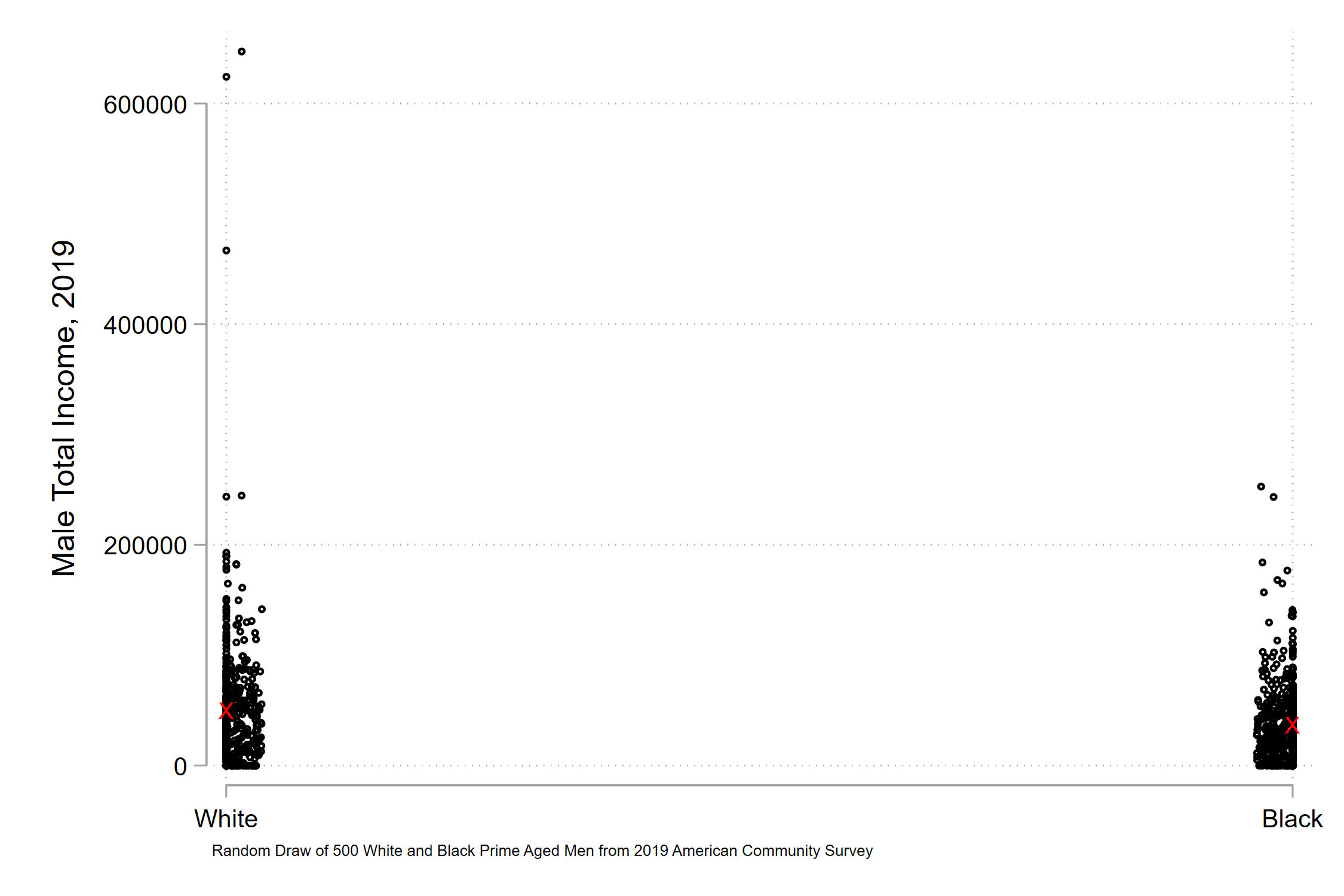
I grabbed data from prime-aged men (25-54) from the 2019 American Community Survey. I took two random draws of 500 white and 500 black respondents. Let’s look at their total income earned.

Some social scientists argue, along the lines above, that you should show the range of your observed data. Zooming into things like means distorts what actually occurs within your data (akin to the distorted face on the top-left of the article example). Let’s do that for our income data:

What do you see? Me, I don’t see any meaningful difference in the mass of the data. Just that there are three or four very high earning white men that pull out the y-axis. What if we indicate the mean differences on the graph?

The red X’s indicate white and black mean annual incomes. You see the white x is slightly above the black x, but there’s not too much of a difference.

But obviously, obviously that’s not true. Just the simple average difference of the two is about $12,500. That’s a meaningful difference. So we zoom in, perhaps in a few possible ways. First, paying no mind to a zero-value.

Then, including a zero-value.

When we focus in on the mean difference of the groups, we see large and meaningful racial gaps in earnings. But these coexist with significant within-group income variation. Low earnings aren’t what generates modern income inequality. High earnings are. So maybe top-values of y-axes matter. Let’s scale the y-axis to $250k, roughly the max earning of our black respondents.

There’s no easy resolution. Which of these figures best illustrate racial inequality? I don’t think the raw data is too helpful, as they suggest that the racial income gap is trivial, when it isn’t. But the mean income gap also misses the fact that modern inequality is primarily driven by the separation of very high income earnings, who create functional inequality among those left behind. If we devote our thinking to the zero-value of the y-axis, we risk sloppy thinking about our goals or using data. And resolving issues specifically about the zer0-value of the y-axis risks trampling on the multiple, complex, not fully-resolvable truths in our data.

Education partisan realignment

I sketched up the below the day after the 2020 presidential election, when folks started to notice the major realignment of education across partisan lines. I think my views have held up ok in the year since. I lightly edited it for clarity, and expanded a few points (I indicate these in brackets).

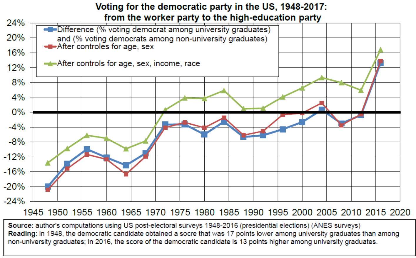
I’ve been thinking about Thomas Piketty’s recent work on the educational sorting of political parties in the United States, with Democrats and Republicans increasingly sorted by those with and without college degrees.

It appears that there is another educational sorting of partisanship by educational attainment, with Democrats increasingly becoming the party of the educationally credentialed.

Perhaps my view is a relic of the time I grew up: the mid 1980s through early 2000s, when there wasn’t as much of an education partisanship. I’d just lift out a few general points (these aren’t super well researched, think of them more as emerging from my recollection of many studies and theories read over the past decade):

  1. Educational partisanship risks blunting notions of “intelligence”, “skill”, and “ability” [so that they fit into more neatly packaged ideological bundles]. But each are highly multidimensional. There is not a single “skill” that can sort all individuals into a single line. Labor economists and stratification scholars do a nice job demonstrating this fact. [Unfortunately, the typical way you see “skilled” versus “unskilled” defined in economics, and often prestige media outlets, refers to folks with and without a college degree.]

  2. Our winner-take-all economy (see Robert Frank) probably distorts the purpose of education. These broader economic forces have, to some extent, refashioned educational attainment as the track on which the race for a larger reward is given to a shrinking number of contestants.

  3. I do not have a clear picture of the era before 1970 visualized in Piketty’s graph above, when higher education was concentrated among the Republican party. That’s history I think I need to learn to help understand the contemporary situation. But it’s worth considering the particular issues that arise when the Democratic party specifically aligns with higher education. [When I participated in instructor training, I would often see a lot of talk and support and resources for things like, “what if a right-leaning students says or does X.” Often, this has been really important, especially because it was based around tamping down and avoiding issues related to sex, race, and sexuality. But what happens when our institution, which should be above partisan splits, gets absorbed into the process of political polarization? This feels new and I’m not sure how to handle it.]

  4. If the Democratic party is becoming tightly aligned with higher education, meaning that higher education is in a more politically polarized position, I believe this requires a deep soul searching of the purpose of contemporary education. My fuzzy thinking is based on two anecdotal points:

    1. I’ve talked with folks who highlight the radical transition of the higher education funding model, from an army of small donations to finding the needle-in-the-haystack billionaire entrepreneur. That’s why you see so many seemingly silly “innovation incubator hub of excellence” institutes popping up across campuses. What reason do people have to support this model of higher education, given that it presents a fundamentally restructured relationship to the broader public?

    2. Similarly, I remember reading a New Yorker article years ago about robotics. A Brown professor was working in a lab, and decided to focus their next hand robot project to pick up blueberries, because that’s a space where a lot of industry funding was available. I don’t know why, but that really shook me. When you look at mission statements of universities, they typically include language of “public service,” “public benefit,” “improving quality of life for all,” etc. But perhaps what happens on the ground is that universities provide discounted access to labor savings technologies, which might undermine the lives and power of folks without college degrees, and soon enough, those with degrees. [If we’re seeing a realignment of the professional class to the Democratic party, higher education to the Democratic party, and higher education’s primary output is labor saving technology and managerial strategies, what does this imply for higher education’s broad mission? I have a lot of unsorted thoughts and worries about this blueberry robotics example that I need to smooth out here some day.]

Anyways, I suspect these will be very eventful years ahead for higher education. Partisan realignment around education makes for new and very weird problems that we’ll have to grapple with.

Political polarization is bad news for (most of) higher education

I read a recent Pew research post with dread. According to this survey, the percent of Republicans who believe colleges and universities have a positive influence on the way things are going for this country declined from 58% to 33% between 2013 and 2019. For Democrats, the percent increased from 65 to 72% between 2013 and 2017, and has declined to 67% since.

The survey only includes a few major institutions, but higher education has the most extreme polarization of views. The D-R gap in positive views towards higher education is 34 percentage points. That’s more than labor unions (23 point gap). More than organized religion (30 point gap). More than large corporations (28 point gap).

This isn’t a result of Republicans having greater social distance from higher education. I downloaded the 2019 Pew data and looked at whether the gap was primarily among those without college degrees (perhaps if you’re not receiving the benefits of a degree, the externalized nonsense of college feels more important). I also restricted the sample to white individuals because, well, racial and ethnic differences in partisanship, attitudes, and relationship to higher education is super, super important and complex.

Uh oh. More education, better views towards college among Democrats. If anything, more educated Republicans have slightly more negative views towards higher education.

What do these patterns imply? I’d argue that if you’re Harvard or Yale or Oberlin or Grinnell, probably not too much. Private institutions have a relationship to the federal government via grants and aid and loans and whatnot, but typically rely on smaller enrollment numbers and much funding through a recruited student body and alumni network (we do too, but also rely on state support). A souring by Republicans probably doesn’t do too much for the private world’s ability to fulfill their mission. I suspect the Harvards of the world will be fine, as they can just find a few hundred very affluent DSA advocates out there who’ll still cut the tuition check.

Yet we in the publics are in a very, very dangerous situation, I submit. Many still rely on state-level funding. And I’d be surprised if any public university has removed from its mission statement language about serving the public, or the people of <statename> or whatever. It’s worth remembering that public universities are very much the load bearers of higher education, as 2/3 of Bachelor’s degrees are attained in public institutions.

Of course, lots of other factors have distorted higher educaiton’s relationship to the public. State funding for public universities has declined substantially, especially following the Great Recession. This has forced publics to be pretty aggressive in finding private monies, and it has also reallocated the cost of higher education onto individual students. So, yes, the mission of the public university has become more fragmented, individualized, and privatized. Perhaps that provides sufficient justification for higher education in all its glory to get consolidated into broader issues of partisan polarization.

And look, I’m about as milquetoast and typical a sociologist you’ll find in terms of my political behaviors, values, and visions of a good society. But for better or worse, higher education is very left leaning. This isn’t some falsehood that Republicans spuriously believe. And as far as I can tell, a pretty central feature of contemporary politics is the hatred and fear that partisans have towards one another. It’s really tough to have an institution live up to its mission to serve the public, broadly, while also caught in this modern political polarization system.

With all this in mind, I keep circling around to the following question without being able to reach a good answer: if higher education becomes functionally monopolized by a particular partisan group, what responsibility does society as a whole have to maintain higher education? I’m a total sucker for the broader mission of higher education. I believe in it. I think that it’s fundamentally a good thing. And at minimum, I’m all about bending young people’s values towards that of the written word, of critical thinking, of engaging with ideas, of expanding one’s worldview and historical focus, etc. But I think all this now co-resides with a very explicit and energetic attempt to use higher education to engage in policy debates, to shift political and social and economic decisions. To have a broader social impact. Personally, I think that’s all overall good. Yet when the energy and direction of this latter movement is pretty obviously consolidating into a single partisan group that makes up slightly less than half the country, does the other half hold a responsibility to continue providing support in terms of finances, bodies, status, esteem, etc? It’s not obvious to me that it does. Which means…well…the public mission of the university doesn’t have a sufficiently broad coalition to be maintained. Which is a very, very devastating blow to the mission of higher education. Ugh.


Inequality: Absolute and Relative

Tim Liao, a fantastic inequality scholar at the University of Illinois, made a really nice point recently re. an argument made by the Economist. He noted the following image, which was described in the Economist as evidence of declining inequality.

Liao made the nice point that the reversal of percent income increases by income groups don’t necessarily mean that inequality declined. Why not? Well, because folks at the bottom, the middle, and the top of the American income distribution make very, very different income levels. So a 4% increase at the top compared to a 7% increase at the bottom might mean very different things in absolute dollar levels.

Let’s start out by plotting US household income percentiles from 2019.

You can see that there are quite substantial differences in income levels across US households (something that shouldn’t be much of a surprise to people these days). The typical household in the bottom quartile makes ~ $30k. The typical household in the top quartile makes almost $200k. Note too that there’s way more variation of income levels in the top quartile (from ~ 140 to 500+k, a range of 360k) than in the bottom three combined (from 0 to ~140, a range of, well, 140k). Let’s just be simple and apply the percent growth to these baseline levels uniformly across the quartiles (something I think is super inappropriate since the pandemic seemed to allow the very top to separate more, but let’s pretend that’s not true for now).

Here’s the comparison of 2019 to a new distribution with the Economist percentages applied:

Obviously these increases between two time periods are very difficult to notice in comparison to the large inequality that exists across households in any one period. The gap between a $400k household at the 97th percentile and a $10k household at the 2nd percentile in any particular year is just way more important than any between-year change.

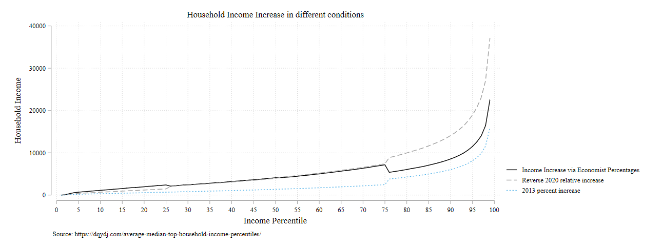
But let’s look at the absolute income growth associated with these inequality reducing percentages.

Obviously it’s incorrect and artificial to apply uniform relative changes within quartiles. There’s no way that the sharp drop between the 75th and 76th percentile exists in real life. But it’s useful nonetheless to see what the relative changes mean in real terms. The Economist graph means that households at the 10th percentile had a roughly $100 / month increase in income, while households at the 95th percentile had a roughly $1,000 / month increase in income. I think it’s worthwhile to explicitly spell out these relative differences to show just how far apart these groups are.

Of course, I can think of two counterfactuals that merit comparison. First, what if the percentages the Economist highlighted were reversed? So that the poorest quartile increased by 4% and the top increased by 7%? Second, what if we observed the relative changes of 2013, with the bottom 75% all experiencing a rough 2% increase and the top experiencing a rough 3% increase?

All the action is at the top of the income distribution. I suppose it matters whether there’s an increase of $15k, $25k, or $35k at the very top. But again, we’re looking at very marginal changes at the bottom. Between household differences are the biggest story in every situation.

We can see this as well if we compute Gini coefficients in each of these scenarios:

So there is, like, the most marginal changes at the third decimal place of Gini coefficients. But nothing I’d write home about.

I think Liao makes a valuable point. I’d just follow up that focusing on percentage or relative or logged income differences are great ways to mask the massive between-household differences that exist in our era of very high inequality. I love using logged outcomes in my own research, but I think it’s important to keep an eye on absolute differences to understand the magnitude of the situation we live in.

The Decline of Children: Not too much to worry about yet

I really love the work by William Frey. He’s a demographer at Brookings. He produced a great report on notable trends in the 2020 Census. What really caught my eye was the decline of the number of youth in the United States:

2021-09-28_13-18-28.jpg

These trends were shocking! For the first time in 30 years, the absolute number of children declined, while the percentage of the population under 18 continued to shrink, from 35% in 1960 to about 22% in 2020. Declining fertility, delayed childbearing, increases in educational attainment, and female labor force participation all contributed to these trends.

With that said, I was initially a little freaked out by these figures. There are few ways to produce adults in a society without first having children be in that society. Frey makes the case more elegantly:

“The 2010-to-2020 loss of over 1 million youths contrasts with gains in that population during the previous two decades. While this is not the first decade to register a loss in the nation’s youth, it is occurring at a time of greater aging of the population. This differs from the situation in the 1960s, when much of the large baby boomer population was under age 18, and comprised 35% of the total population. This youth share dipped over time and has now reached 22%.”

It seems like there are a few aspects to interrogate to determine how concerned I should feel:

  1. The percent of the population under 18.

  2. The inter-decade absolute change in the number of youth.

  3. The relationship between youth share of the total population and the absolute change in youth population.

  4. The association between youth population change and change in the non-youth population.

Let’s situate these in the last century or so to get a sense of how the 2010-2020 change compares to previous changes. I grabbed decennial census data, for total population and under 18 population.

_frey01.jpg

hmmm….we’re seeing a secular decline, with a brief baby boom pause, for the past century+. The anomaly was the high % of kids in the baby boom era, not the decline in recent decades.

OK, what about the absolute change in youth between decades?

_frey02.jpg

Welp…not the first time we’ve seen an absolute decline in the absolute number of children. I suppose if we have two plus census waves of child decline there would be cause for concern. But nothing in recent decades sticks out as a massive shock.

Does the absolute change in # of children do much to affect the percentage of children in the country?

_frey03.jpg

…meh. Not really. There’s just a declining % of children in the country over time. That’s probably more a function of stretching out life expectancy. Absolute change doesn’t really seem to do much. What of the comparison of child population change versus non-child population change?

_frey04.png

Nothing too remarkable. It looks like the non-child population can keep climbing regardless of the child fluctuations.

_frey05.png

If we look at lagged child population change against non-child population change … there’s not a lot going on. I’m not much of a demographer, so I don’t know the optimal way to assess the link between child population change and non-child population change. But it looks like we’re not seeing any kind of demographic catastrophe driven by child population trends. That’s likely a mixture of immigration and extension of life expectancy.

Overall, it seems like the 2020 Census didn’t tell us anything we couldn’t have predicted from the preceding 10 censuses. I’m not as alarmed as when I first saw Frey’s post. It seems like the US has occasionally had declining child populations, but that hasn’t necessarily resulted in a long-term decline of children or the overall US population. The 2030 census will be informative. But until then, I’m probably not going to spend too many sleepless nights worrying about the trends from the 2020 census.

Is Cal Newport radicalizing? Productivity thoughts

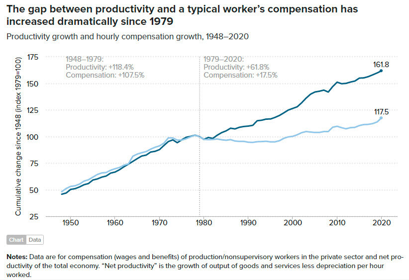
A great academic recently shared one of Cal Newport’s new New Yorker blog posts: The Frustration with Productivity. It’s a great, interesting read. I really like Newport’s big point: if employers want more productivity, they can’t individualize the process. Same way that Henry Ford didn’t ask individual workers to design the factory layout. I’ve got to admit that I like to see Newport get a little radical. It seems like he’s become a bit more comfortable with ruffling the feathers of the knowledge work world. Go Cal!!

However, I’d just add the following. Why are people increasingly frustrated with focus on productivity?

Hmm…

hmm01.jpg
hmmm02.jpg

Life’s just full of unknowable mysteries, isn’t it?

The social distance of social distance

We live in truly weird times. A few days ago a front-page New York Times article describes the “hellscape” of professors teaching in red states where mask requirements are not implemented (the title has been changed, presumably after generating sufficient engagement, to remove the word hellscape). I have also seen these messages bubble up: instructors pleading for students to wear masks and students not complying.

A few caveats: I’m vaccinated, I don’t mind masking myself. If I were a dictator, I’d probably first impose a vaccination mandate and then demand some constitutional democracy be instituted.

I have a harebrained theory that I suspect is about 45% correct. I suspect that many of the academics verbalizing concern about in-person and masking issues have mostly worked from home and know people that worked from home. I’m guessing that there’s a much greater diversity of pandemic experiences among the student body, especially in lower-income and redder states.

Here’s information from the Census Pulse Household Survey about “telework.” Respondents were asked: “Working from home is sometimes referred to as telework. Did any adults in this household substitute some or all of their typical in-person work for telework because of the coronavirus pandemic, including yourself?” Roughly 37% answered “yes.” Let it sink in that about 2 out of 3 did not. That is a lot of people.

Here are the relationships with stay at home work and SES.

2021-09-14_5-55-30.jpg

And below is the relationship between staying at home and education

2021-09-14_5-55-52.jpg

If you look very, very closely, you might notice a relationship between higher SES (income / education) and working from home.

Here’s my theory: I’m guessing a lot of academic folks have been staying at home and know lots of people who have stayed at home. I’m guessing that lots of the students, especially those at lower-income / redder schools, have either been forced to work in person themselves or have had 1+ people in their households working in person.

It must be nuts for an academic sheltering in place for 18 months to encounter someone who’s not totally on board with their preferred bundle of NPIs. And it must be nuts for students to, after 18 months of being in the in-person soup, encounter this intense fear.

Obviously, the world isn’t as precisely and perfectly subdivided by blunt social categories. Lots of variation around central tendencies. But I’d guess that we’re seeing the outcome of segregated worlds crashing back into each other.

It's been a long three to five years

Me, August 2016, joining the University of Illinois sociology department:

MCDTITA_FE028.jpg

Me, May 2021, reading the letter verifying tenure status in the sociology department at the University of Minnesota

v3.png

It’s been a long three to five years on the tenure track, depending on how strictly you want to apply rollback statuses. I am [1] much more cynical about the mechanisms that generate outcomes in higher education [2] grateful of the many folks in this field who nevertheless operate with a weird amount of generosity to help expand other’s opportunities and move forward their careers [3] humbled by the sheer amount of luck and randomness that influences who ends up getting to this point.

Educational polarization is found among black people too

In the last blog post I looked at cohort changes in the link between educational attainment and political party identification, in response to David Shor’s tweets.

In the 2020 election, there seems to have been some surprise about the inroads made by Trump among racial and ethnic minorities. I think it makes sense to examine whether the same kinds of intergenerational education polarization occurring among white individuals are occurring among nonwhite individuals. I’m going to focus on black individuals since other racial groups don’t quite have the large sample sizes across GSS waves to provide a good intercohort comparison.

What has happened to black respondents in the education-party polarization link across birth cohorts? Let’s begin with those with a college degree or more (this includes those with advanced degrees, due to small sample sizes to visualize across age. I’ll break apart advanced degree holders below).

blog04-polparty-black-colplus.png

Interesting. Black individuals with a college degree have traditionally had very high rates of Democratic party affiliation, at rates between 80-90%. But look at Millennials and Gen Z’ers. Big declines in Democratic affiliation, and big rises in Independent affiliation. Gen Z’ers have Democratic party affiliation 20 percentage points below Boomers and Gen X’ers. Again, the transition is to “Independent,” not Republican. Are highly educated Independents likely to jump to the Republican party? I doubt it. But it suggests that this group of voters is less attached to the Democratic party.

Do we see the same transition away from the Democrats among lower-educated black individuals as we saw among white individuals?

blog04-polparty-black-lths.png

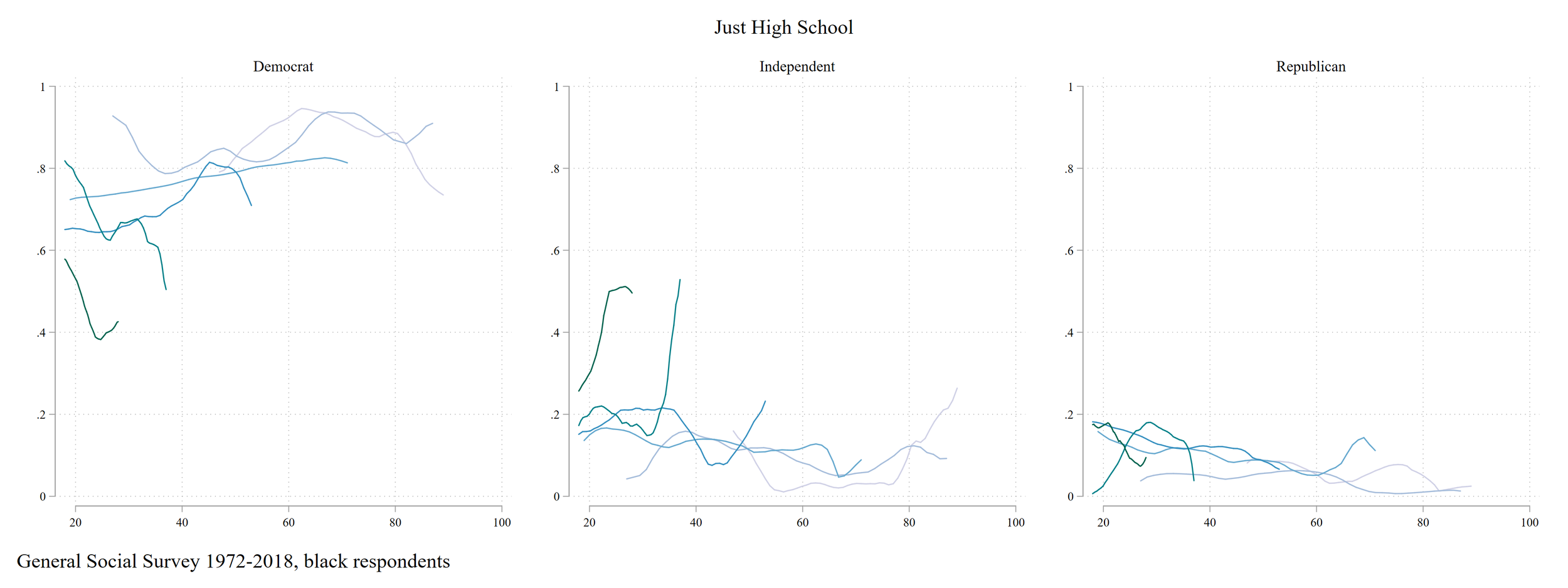
Yes! Lots more noise because there are fewer black GSS respondents, but a massive decline in Democratic party affiliation among those with just a high school degree, from about 90% in earlier generations to about HALF among Gen Z’ers. There’s a bit of growth among Republican party affiliation, but most of the Democratic decline seems to be channeling into “Independent.”

Let’s look at Some College

blog04-polparty-black-somecol.png

This looks a bit more like what I anticipated to find among white respondents. A modest but detectable decline in Democratic party affiliation among those with some college.

Let’s compare trends among white and black individuals across cohorts.

Blue line=Democratic, Black line=Independent, Red line=Republican

Blue line=Democratic, Black line=Independent, Red line=Republican

I draw two main points:

  1. The decline of Democratic affiliation among lower educated folks is clearly occurring, and the decline is much more noticeable among black individuals than white individuals. Independent, not Republican, is the big winner of this transition. However, you can see a growth in Republican affiliation among low-educated black individuals: really the only place Republicanism has grown across birth cohorts.

  2. The growth of college/Democrat is primarily found among white individuals. There was already a much tighter connection among black individuals. But we’re seeing younger black individuals with college degrees decline in affiliation with the Democratic party. Seems likely highly educated white and black individuals are meeting at a polarized point in between previous cohorts.


Taking a step back: education polarization seems to be occurring broadly. In fact, black and white individuals look a tad more similar in political identification among Gen Z than among the Greatest generation, while party affiliation across education groups has diverged. Let’s look at that by visualizing the relative difference of party affiliation across racial groups.

Red line=Republican: Blue line=Democrat: Black line=Independent.

Red line=Republican: Blue line=Democrat: Black line=Independent.

The zero-line in the above graphs would indicate that black and white individuals in a particular birth cohort have the same rates of party identification. The further away the lines are from zero, the more different are black and white party affiliations in a particular birth cohort for a particular education level.

I think what we can obviously see is that there is less racial polarization across education levels among Millenials and Gen Z’ers than among the Greatest and the Silent generations. I’m really curious about Gen Z’ers. Is the big equalization an artifact of noisy data that will smooth out with more GSS waves, or is there a pretty radical realignment among today’s youth?

I am personally somewhat troubled with the alignment of higher educational attainment and political partisanship. I view the mission of public institutions of higher education as serving the people of the state. But that’s going to be very difficult if college emerges as a primary driver of political polarization. This trend in polarization is probably a strength for some private institutions like Harvard and Oberlin who can more narrowly target their mission and are decoupled from state-level funding decisions. But public institutions are the workhorses of higher educational attainment and probably will strain under the weight of a central location of political polarization. We’ll see!


How has the education-political party link changed?

David Schor, political analyst now famous for presumably being fired for tweeting a research article at an inopportune time, recently highlighted the fact that the Democratic party is increasingly concentrated among those with a college degree or more. He focuses on white individuals, presumably because of the troubled history of the Republican party rallying against, and thus recruiting, racial and ethnic minorities, particularly black individuals.

s01.png
s02.png

https://twitter.com/davidshor/status/1387134153775321096

Yup. It’s easy to see a transition over time. I was curious about the cohort dynamics. Is this basically a cohort replacement situation, or are folks changing their minds as they age?

I used General Social Survey data between 1972 and 2018. First, let’s look at the change in educational attainment over time.

blog03-edpol01-edtime.png

Unsurprisingly, we see educational attainment grow over time. WAY fewer people have less than a high school degree, the percent of folks with an advanced degree has doubled, from about 5% to about 10%, as has the percent of folks with a college degree, from about 10% to about 20%.

So how has political party identification changed in this sample over time?

blog04-whiteparty.png

I’m no expert in politics, but this looks about right to me: the rise of the Republicans in the 1980s, the decline of the Democrats through the 2000s, and the moderate rise of the independents in recent years.

Now, changes over time that motivated the Shorr tweets can hold a lot of heterogeneity. I’m curious about intercohort changes in the patterns noticed. Are we seeing substantial realignments within cohorts, or between them? I separated the GSS samples into six rough birth cohorts: (1901/1926 "Greatest Generation") (1927/1945 "Silent Generation") (1946/1964 "Baby Boomers") (1965/1980 "Gen X") (1980/1989 "Millenial") (1990/2000 "Gen Z"). Then, I tracked education / party identification in these cohorts across age.

First, let’s look at the party affiliation across cohorts and age among those with just a college degree.

blog04-polparty-white-college.png

Massive intergenerational change. At roughly early middle age, 30ish-40ish, the Greatest Generation was 30% Democrat. Among millennials, it’s 60%. Two other points: [1] I see a simple transition from Republican to Democrat. Not a lot of interesting action going on among Independents. [2] The only cohort with much within-cohort change is the Silent Generation, whose Democratic affiliation plummeted between their 30s and 80s. Boomers, X’ers, and to a lesser extent, Millenials are more stable.

What about folks with just a high school degree? I’ll use the same color scheme.

blog04-polparty-white-jusths.png

Huh…this isn’t what I expected. I assumed that High School would shift towards Republicans. Instead, it looks like Democratic dominance hemorrhaged to Independents. This is reminiscent of the lack of institutional incorporation working class and lower educated folks are facing these days.

Let’s move onto those surrounding High School, “Less than High School” and “Some College.”

blog04-polparty-white-lths.png
blog04-polparty-white-somecol.png

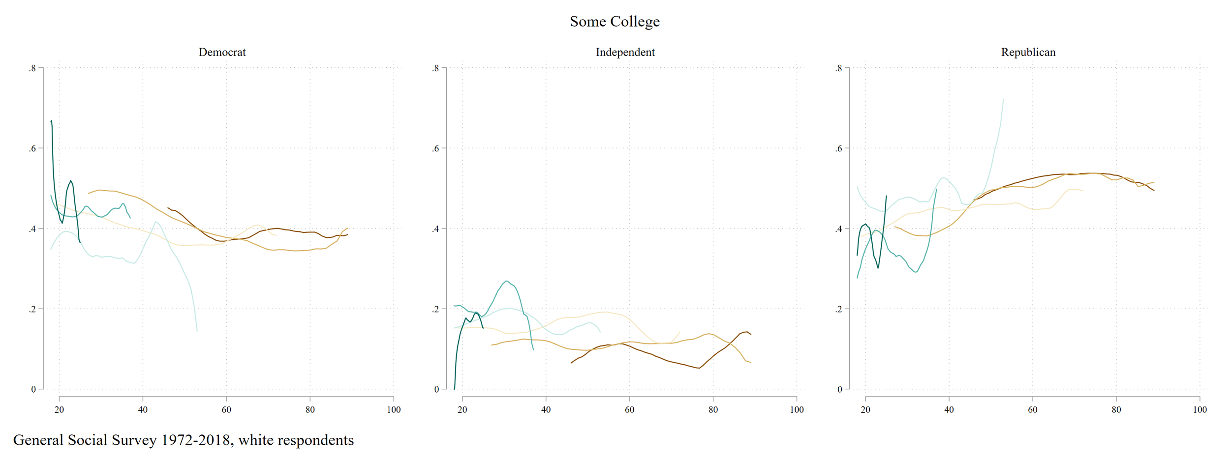
Hmm…not a lot of action among “Some College.” I thought this group would have sharp changes over time due to feelings of being spurned and indebted. But I guess not! For “Less than High School,” we again see an exodus from the Democratic party, but into Independent identification.

Ok, finally Advanced Degrees. No Gen Z, because they’re too young!

blog04-polparty-white-advdeg.png

WEIRD! Where’s the massive Democrat-ification!? It’s just not there, except for some weird and certainly idiosyncratic noise at the tail end of the Millenials. Advanced degree holders are pretty consistently 55/40 Democrat/Republican. So the massive transition to the Democrats is from the lower educated to the higher, but not highest, educated. At least for now.

Without much knowledge about political parties, it seems like Democrats hitched their wagons to the right rising demographic group. Folks with a college degree are growing in numbers, especially among younger cohorts. I’m confused about what’s going on with Independents and Republicans. Is “Independent” just code for Republican? I do worry about education polarization, as Democrats, who presumably are the party who provides economic protection for the less economically well off, are not connected to the least economically well off, at least proxied by education levels. And sadly, the jettisoning of institutional affiliation among those with less education mirrors the broader exodus of institutional affiliation and protection among folks on the lower end of the socioeconomic distribution. What I’m really curious about is how these trends compare to those found among Black individuals. I assume that Black folks in the GSS start with a higher rate of Democratic affiliation, but are the intercohort trends similar? That’s my next post!


I love Cal Newport, but...

I am a big fan of Cal Newport. I have read all his books. His thoughts on the insidious nature of social media and, more generally, internet distraction were revelatory. I appreciate his thoughtful approach to developing one’s productivity. I wish I were more like him. I earnestly hope my kids are as focused and dedicated and productive as he is. One needs these voices in the weird world of knowledge work and digital distraction that we live in. Fundamentally, he fights the good fight against the trashy crassness of modern internet-saturated culture, and he provides useful tips for how to get stuff done.

But…but. There’s something that has always been off about his argumentation to me. I started thinking about it while listening to his podcast. He discussed some of the pushback against his method. One of his responses stuck out to me. In short: he referenced economic materialists who challenged his method as a method to increase productivity within an exploitative system. His response: his organization method (the funnel of productivity) is a general process. It doesn’t need to be tethered to the particular capitalistic system. Use it as a general tool applied to your particular goal. Everybody needs some method of organization system (not having one is itself a system), everybody needs to do things. Use this method for your general aims.

This sounds quite reasonable. And I think that it’s 90% correct. But that 10% lingers and irks my contrarian sensibilities. I think two stories help explain my views.

The first: have you ever sat in a meeting with university tech folks launching a new platform (or whatever the contemporary words are)? A common refrain that I’ve heard: "You’re the expert. You provide the content, we’re just setting up the medium that allows you to X. “ That’s obviously not true. Content and medium are not easily separated, as anybody growing up with and without the internet or smartphones should be well aware. The medium is the message, right? Anybody using Canvas or Doodle or KaBoink or LoopyDoop or whatever’s coming next knows that the medium creates very real structural constraints, values, and incentives to work in certain ways.

The second: the modern professional managerial class, their children, and their educational institutions are stressed and straining. White collar parents are exhausted porting their children between Mandarin immersion lessons and upsidedown polo club. Universities are opening lazy rivers and fancy student housing. Why doesn’t everyone just chill out, am I right? Frankie says relax, and I’m sure it’ll work out! Well, in a modern winner-take-all economy, what matters is comparative advantage. So falling off the race creates very real risks of falling into precarity (the middle class and a life of mediocre security has fallen away, if you’re not aware). It’s not the absolute development of upsidedown polo that matters: it’s the comparison between your kid and the kid who’s doing it all, when gunning for a highly competitive and narrow set of opportunities.

The former story highlights the fact that general tools can of course be ported across contexts or content. But they embody incentives and constraints, necessarily.

The latter story highlights that one’s place in the world is developed in comparison to the place and activity of others.

Newport tries to address anti-productivity critiques and argues in favor of a “productivity funnel,” in which productivity is a function of three processes: selection (generally, what you say yes to) organization (planning/mapping/processing your tasks) and execution (doing things effectively). Newport states in a recent email newsletter:

“This detailed definition also adds nuance to anti-productivity criticism. A lot of this recent debate loosely associates the term “productivity” with an exploitative capitalist drive to maximize accomplishment. When viewed against the specificity of the productivity funnel, however, it becomes clear that this critique more accurately concerns only the activity selection level.

I agree that there’s an important debate to be had about how organizations and individuals implement activity selection (e.g., my recent post on slow productivity), but regardless of where this debate takes us, the other levels of the funnel remain important and largely orthogonal. In a post-capitalist collectivist utopia, where work is optional, and we’ve excised our souls of our past bourgeois internalization of the narratives of production, we’ll still have things we need to get done, and having an organizational system will still be better than haphazardly trying to keep track of these things in our minds (even Lenin had a task list).”

I get it. And from a certain perspective, this makes so much sense. But it ignores the fact that seemingly general systems impose constraints, incentives, priorities, values. And it sidesteps the critical point of comparative advantage: my ability to live life minimizing productivity is partially contingent on the risk of falling behind others in an increasingly winner-take-all, commodified society. A relentless focus on maximizing productivity at work and self-actualization in non-work time shifts the competition in the game, especially in a world of increasing inequality and polarization (ask the white working class how not keeping up with the Joneses (MS, ED, PhD) is working out). The relentless maximization of productivity, or cultural talents in our children, or amenities in university rec centers, flows from relative comparison, not absolute within-person productivity levels.

So I’m definitely going to use the productivity funnel concept in my work life. I actually love the concept. I’m definitely going to continue to try and maximize work at work time to maximize the quantity of time I can spend with my children. But my personal productivity emerges from a deep reluctance and sorrow, from the turning and turning in the widening gyre as the center collapses and the peak of opportunity narrows. I argue that the system of productivity or actualization maximization is partially a low road of development. We’re far down that path so there’s not a lot to do to fight against it.

Productivity practices and systems are so useful. But the whole thing feels like a self-perpetuating system of perverse incentives and requirements. No need to rally against a caricature communist utopia nor wholesale adopt an organization system as a general portable tool to realize this, and I’m not convinced any individual decision can solve it.

Future ASA reports on collider bias

Recently the ASA published a report urging departments to end using the GRE when considering graduate school applications.

realasa.jpg

I don’t have too strong an opinion about this. The most persuasive criticism I read was that most of the studies cited are faulty for conditioning on a collider. I’ve also seen this referred to as Berkson’s paradox.

See here

and here

Basically, if you restrict your attention to a nonrandom sample selected on the characteristics you’re interested in studying, you might find the opposite association than that actually exists in the population that matters. If you focus on the relationship between conscientiousness and IQ among folks in college, the slope may be negative. But college admission selects on each of these categories, so in actuality, there is no relationship, or a positive relationship, between these traits.

The criticism of the ASA report is that most of the cited studies fall victim to this faulty logic. Therefore, I thought it would be fun to make some potential headlines of future reports that accidentally fall victim to collider bias (these are satirical, made by me, and are meant to be funny. Whether they are is an open question). Enjoy!

asa07.jpg
asa06.jpg
asa08.jpg
asa09.jpg
asa05.jpg
asa04.jpg
asa03.jpg


Descriptive trends: labor force nonparticipation by education and gender

The last sixty years have had some consequential and odd shifts in labor force participation, or those who are not in the labor force (NILF). The difference between unemployment and NILF: you are unemployed if you are actively looking for employment. You are NILF if you do not have a job, operate a farm/business, work for pay, and you are not looking for work. I’ve seen this arise primarily in discussions on the rise of NILF men, with primary focus on the role of opiates and video games as potential drivers.

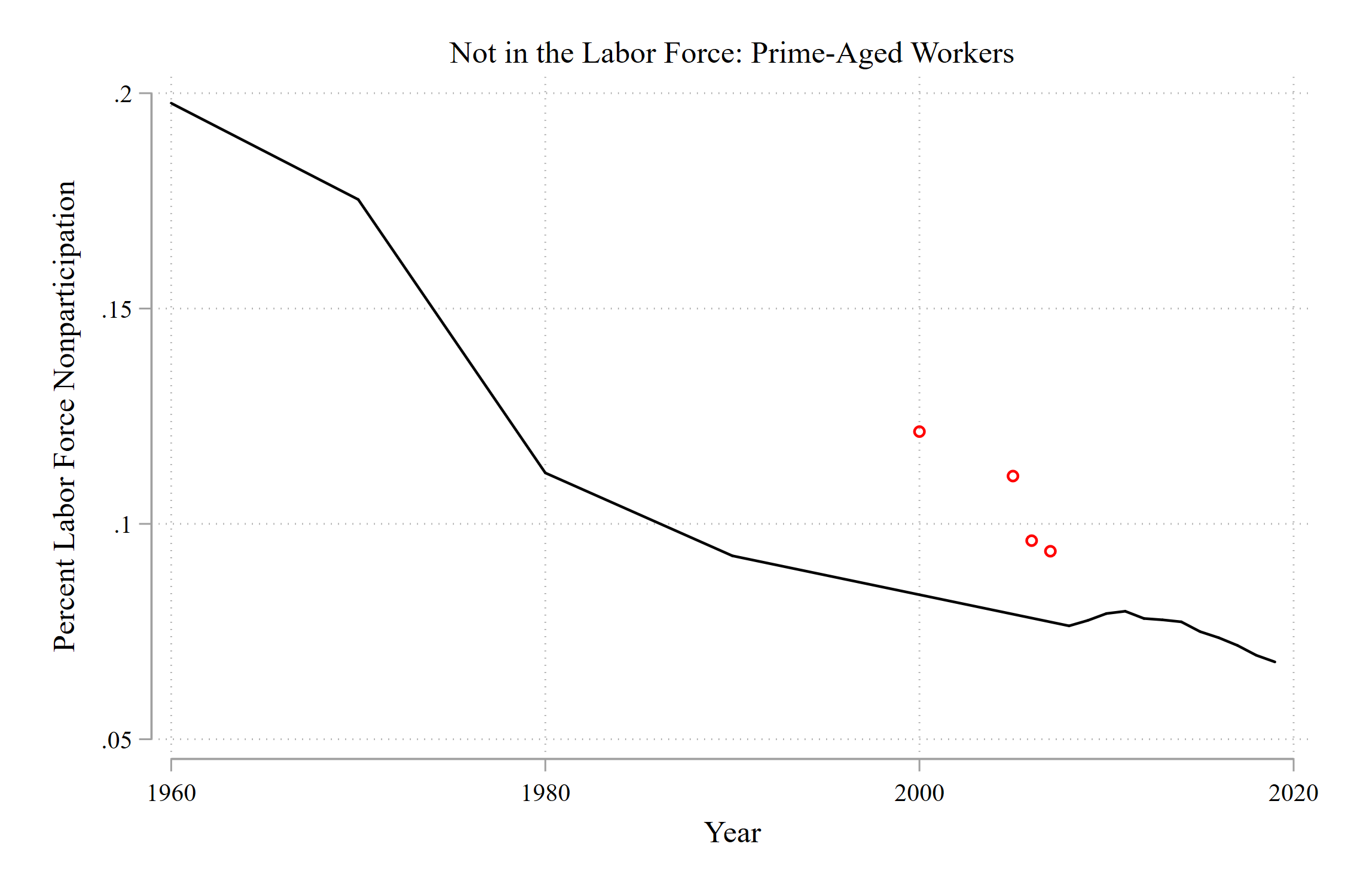
The trends below are from the US Census and American Community Survey. I’m looking at prime-aged folks, between 25 and 54. This restriction lets us not be too worried about things like educational attainment and retirement driving results. Don’t hang your hat on 2000-2008 data, because there’s some oddities in the Census these years. I left them in the first few graphs but didn’t use them to connect the trend line.

blog01-nilf01-all.png

A massive decline between 1960 and today of labor force nonparticipation, from about 20% of prime-aged workers in 1960 to about 7% in 2019.

Obviously, gender is one of the main drivers of these trends. Women entered the labor market during this period in revolutionary numbers.

blog01-nilf02-gender.png


Whoa. A decline from 40% NILF among women in 1960 to about 10% today. The latter half of the 20th century was, indeed, revolutionary. I see maybe a slight increase among men but nothing I’d write home about.

Which women are driving this trend? As you’ll see, education is a clear marker of NILF status. Results below are gender-by-education trends.

blog01-nilf04-gender-ed.png


You see the group with the lowest nonparticipation is college-educated men. Then, college-educated women and men with a high school degree or less have converged to essentially the same levels by the 2010s. High school educated women have the highest rates of labor force nonparticipation. The fates of women with different education levels began to diverge in 1980.

I like these trends because they’re kind of like that optical illusion where the rabbit can be a duck. Lots of attention has been placed on less-educated men’s growing nonparticipation. It’s growing to the level of highly educated women! Puts things into perspective. Women, especially women with a college degree, have made great strides in the labor market. Their labor force nonparticipation has declined to levels of less-educated men!

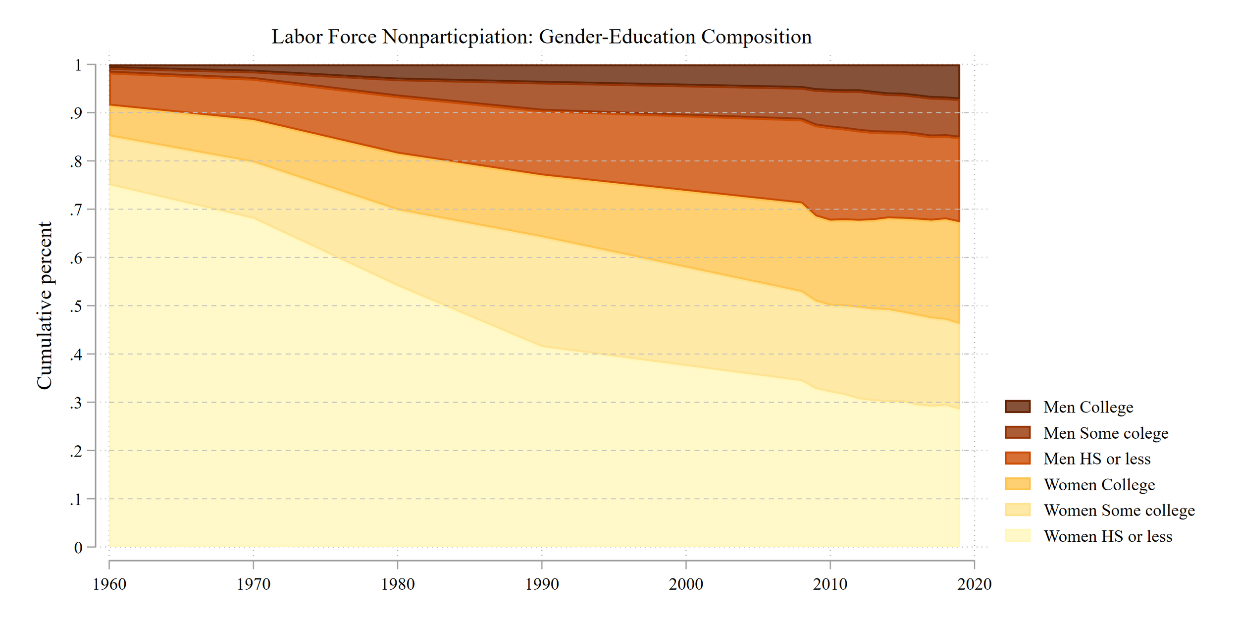
Overall, labor force participation has declined among prime-aged workers. How has the composition of this group shifted over time?

I look at the total NILF group and split it into six groups: men and women by three education categories: high school or less, a college degree or more, and in between. First, let’s just look at the change in the composition over time.

blog01-nilf05-nilfcomp.png

A revolution in compositional change. In 1960, almost 8 out of 10 folks 25-54 not in the labor market were lower educated women. Today that number is 3 out of 10. Labor force nonparticpation declined from 90% female to 70% female over time. NILF women have increased in their educational attainment. At the same time, men’s share grew from less than 10% to a tad over 30%. This growth was most driven by those with a high school degree or less.

Another way to look at these trends is to force the composition to the overall percent of folks not in the labor force.

blog01-nilf06-nilfcomp-total.png

It’s a little trickier to see the changing composition here. The big points, which seem to be the most important, are [1] women’s educational attainment has dramatically increased during this time, meaning fewer women with lower education levels and [2] more women entering the labor market, thus women make up a smaller share of labor force nonparticipation.

I don’t have much insight or wisdom to cap things off. I find these trends pretty interesting. I hope you do too!