I’ve been listening to the audiobook version of Daniel Markovits’ The Meritocracy Trap: How America's Foundational Myth Feeds Inequality, Dismantles the Middle Class, and Devours the Elite. It provides a compelling argument for why the mechanisms of meritocracy — which seem like they should expand opportunity and reduce class rigidity — have ended up creating a system of injustice and social reproduction at the top. It also discusses why the notion of meritocracy, in its current experienced form, creates a bunch of downstream problems in society, and why it’s so difficult to argue against the idea of meritocracy.
I’ve been enjoying listening to this book. Markovits is a law professor at Yale and has special qualitative access to the inner workings of the contemporary “Meritocracy Trap” which makes his assessments all the more compelling. As someone who is interested in inequality, some of the points about inequality are a tad redundant from my other readings, and argumentation from inequality trends can be a tad overly blunt and deterministic for my taste, but the driving kernel of the book is fantastic.
One point that stuck out to me was in Chapter 4. Markovits argues that inequality in the top 5% of income earners is substantially larger than inequality in the bottom 70% of the income distribution and that this gap has grown over time.
Later I looked at the .pdf book companion and saw graph corresponding to this point.
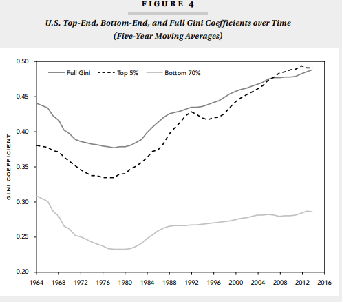
Wow! Compelling stuff. Inequality scholars have similarly highlighted top income earners as driving inequality over time. So this generally aligns with the story I’d expect to see, but the magnitude of the difference of the two subgroup Gini coefficients was very striking! Markovitz notes that inequality among the bottom 70% resembles Norway, and inequality in the top resembles India.
I like making Gini coefficients myself and never thought to construct them in different parts of the income distribution. I’m flying a bit blind because the notes don’t totally explain the construction of the coefficients. I’m not entirely sure whether these trends refer to wages, annual incomes, annual incomes of all workers or those not self-employed, or household incomes. I’m not sure whether age ranges are restricted to those of working age or not. But it’s a public facing book, so I don’t hold that limitation too much against it.
I decided to tackle this topic too, but I’m having a bit of trouble replicating some of the results.
First, I decided to take a look at wages, because wage inequality is a major focus in my own work. Wages are also the workhorses of most inequality trends among the “bottom 99%.” While I think that’s interesting, it probably means that I’m missing many of the people who Markovits is talking about. I’m using Census longform and American Community Survey data between 1940 and 2016. (notes at the bottom describe the sample a bit more)
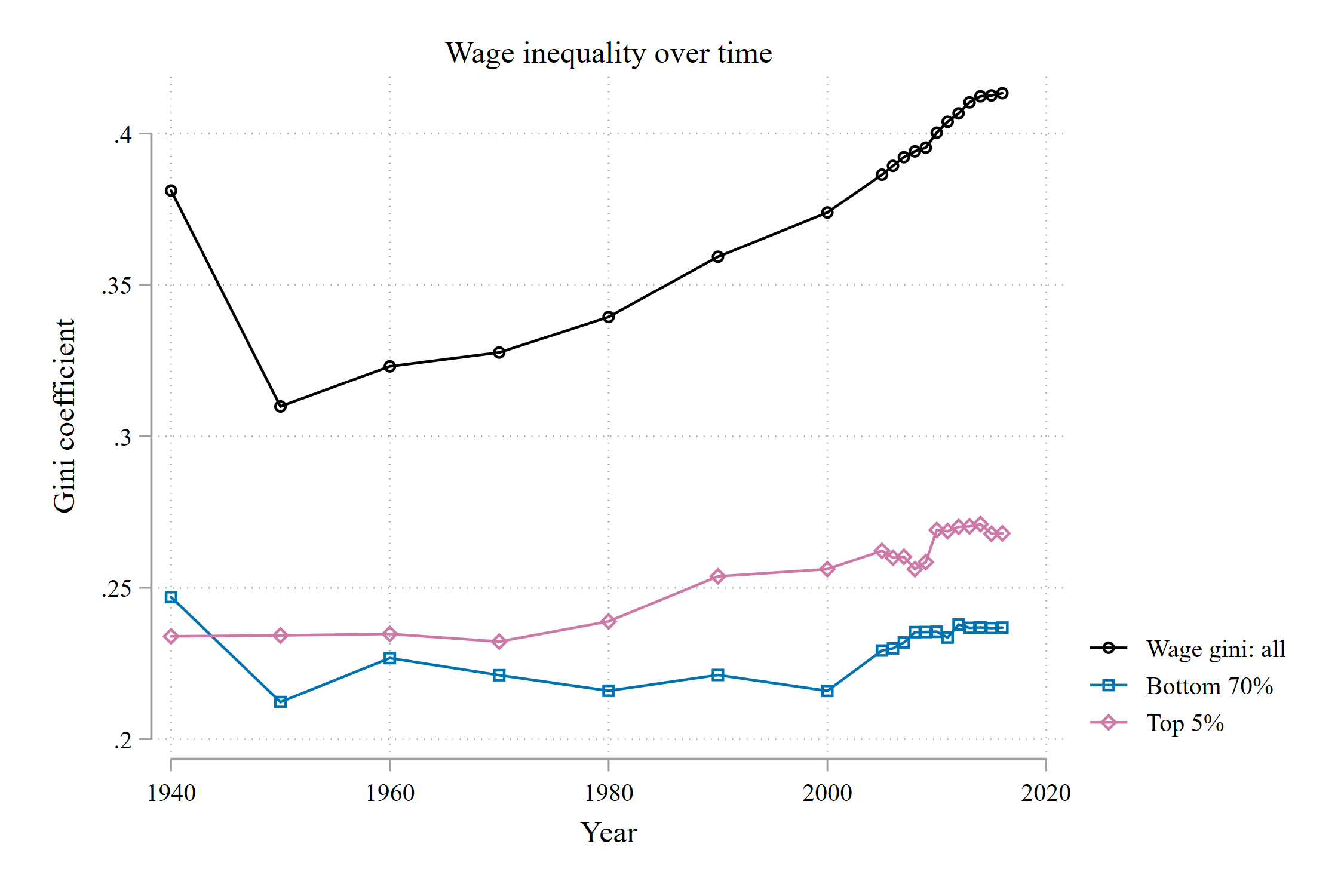
Hmm, some of the trends here are similar to Markovits’ figure, and some aren’t.
Inequality among the top (95th wage percentile and above) and the most (70th percentile and below) were pretty similar from 1940 to 1970. We start to see the two diverge at 1980.
Inequality among the most has grown a bit in the 2000s, but top inequality remains distinctively higher. Top inequality is about 3 Gini points higher today than most inequality. This divergence is a major event for the contemporary high-inequality era from 1990 onward.
I don’t see the massive gap in Gini coefficients between the top and the most.
In my mind, it kind of makes sense that top inequality and total inequality wouldn’t totally overlap. A big driver of overall inequality is the separation of top wages from median wages. That growing gap isn’t accounted for in the figures, but should contribute significantly to overall inequality trends.
Next, I thought I’d try total annual income inequality, from sources not just salaries and wages. This should get some more spread, and it includes self employed workers, which should be important for top-end inequality.

We don’t see the massive amount of top inequality compared to the rest. It’s easy to see the general stagnation of inequality among the bottom 70%, and the rapid growth of inequality among the top 5%. By 2000, inequality in the top equaled, or outpaced, inequality in the bottom 70%. Even though the figure isn’t as striking as the one from Markovits’ book, I still find it striking and illustrative of the revolutionary era of inequality we live in.
But again, I can’t find the trend where the top is India and the bottom is Norway.
Finally, I thought I’d try household inequality. Incomes in a house are typically pooled. With the rise of dual earning households and the class stratification of marriage, perhaps the big trends identified by Markovits occur at the household level:

Hmm…no again. Household inequality has been growing since 1980. But I don’t see much action in either the bottom 70% or the top 5%. And here, we see much more inequality among the bottom 70% than among the top 5%. Lots of the overall inequality growth since 1990, I imagine, comes from the separation of top income households from those in the middle and bottom.
It’s tempting to say that the figure in Markovits’ book is incorrect. I do not claim this. Why?
If I’ve learned one thing during my time in this academic gig, it’s that I should always, always assume that I personally did something incorrectly and search like hell for where that mistake occurred. Scott Long discusses “the universal aptitude for ineptitude.” I’ve repeatedly learned the truth of this phrase. It’s highly likely that I’ve made some boneheaded mistake interpreting Markovits’ figure, or in constructing my own. I haven’t spent as much time making these figures as I would if I were writing a real piece of research. Here are my main suspects of where I screwed up:
Perhaps top-codes in the Census are not correct to assess the influence of very high earners. I’m using the coding logic of David Autor and David Dorn, so I feel pretty comfortable with my decision as applied to employed individuals at the 99th percentile and lower. But that 1% can make all the difference, especially for recent inequality trends. I’m suspicious that the total of the difference could come from top coding, but it’s possible.
I may be using the wrong sample or income definition. Perhaps Markovits is presenting wealth inequality? His presented trends would definitely align with what I’d expect for the wealth distribution. Alternatively, perhaps he is including ALL individuals over 16, not just those of working age? That might narrow the folks in the top 5% to those at the very, very top. Perhaps he includes zero incomes? There are so, so many ways that samples can be defined and income can be coded.
So where does this leave us? At the moment, I would tentatively claim the following:
I agree with Markovits that income and wage inequality among the top 5% of earners has grown substantially and now outpaces inequality among the bottom 70%.
I disagree with Markovits on the strength of the comparison of inequality between the top 5% and bottom 70%. I couldn’t find a situation where one was India and the other was Norway.
I agree with Markovits that focusing on this topic is of utmost importance. Despite my counter claim in point 2 above, the growth of inequality in the top 5% still has massive consequences for the relative and comparative components of income. I think this point drives his book, and I think my evidence aligns with it.
I believe Markovits’ findings are restricted to individual earnings, not pooled household incomes.
Why are all my pink and blue lines so much lower than the overall black line? Well, while inequality within the top 5% and the bottom 70% are very important, the gap between the top and the middle has grown substantially over time, and has been very important for inequality too. I think the contribution of the top separating from the rest is masked in the figures of this post.
Notes:
Wages: Sample is employed, but not-self employed, not in group quarters individuals aged 16-64, with non-zero earnings. Wages are bottom-coded at 1/2 the year-specific minimum wage. Top codes are roughly applied by multiplying wages in the 99th percentile and above by 1.5
Income: Any non-zero income, positive or negative, from any individual aged 16 and up. Income from all sources, not just salary and wages. Top codes are 1.5 times the 99th percentile. No bottom coding.
Household income: Incomes (discussed above) are pooled among household units.