Tim Liao, a fantastic inequality scholar at the University of Illinois, made a really nice point recently re. an argument made by the Economist. He noted the following image, which was described in the Economist as evidence of declining inequality.

Liao made the nice point that the reversal of percent income increases by income groups don’t necessarily mean that inequality declined. Why not? Well, because folks at the bottom, the middle, and the top of the American income distribution make very, very different income levels. So a 4% increase at the top compared to a 7% increase at the bottom might mean very different things in absolute dollar levels.
Let’s start out by plotting US household income percentiles from 2019.

You can see that there are quite substantial differences in income levels across US households (something that shouldn’t be much of a surprise to people these days). The typical household in the bottom quartile makes ~ $30k. The typical household in the top quartile makes almost $200k. Note too that there’s way more variation of income levels in the top quartile (from ~ 140 to 500+k, a range of 360k) than in the bottom three combined (from 0 to ~140, a range of, well, 140k). Let’s just be simple and apply the percent growth to these baseline levels uniformly across the quartiles (something I think is super inappropriate since the pandemic seemed to allow the very top to separate more, but let’s pretend that’s not true for now).
Here’s the comparison of 2019 to a new distribution with the Economist percentages applied:

Obviously these increases between two time periods are very difficult to notice in comparison to the large inequality that exists across households in any one period. The gap between a $400k household at the 97th percentile and a $10k household at the 2nd percentile in any particular year is just way more important than any between-year change.
But let’s look at the absolute income growth associated with these inequality reducing percentages.

Obviously it’s incorrect and artificial to apply uniform relative changes within quartiles. There’s no way that the sharp drop between the 75th and 76th percentile exists in real life. But it’s useful nonetheless to see what the relative changes mean in real terms. The Economist graph means that households at the 10th percentile had a roughly $100 / month increase in income, while households at the 95th percentile had a roughly $1,000 / month increase in income. I think it’s worthwhile to explicitly spell out these relative differences to show just how far apart these groups are.
Of course, I can think of two counterfactuals that merit comparison. First, what if the percentages the Economist highlighted were reversed? So that the poorest quartile increased by 4% and the top increased by 7%? Second, what if we observed the relative changes of 2013, with the bottom 75% all experiencing a rough 2% increase and the top experiencing a rough 3% increase?
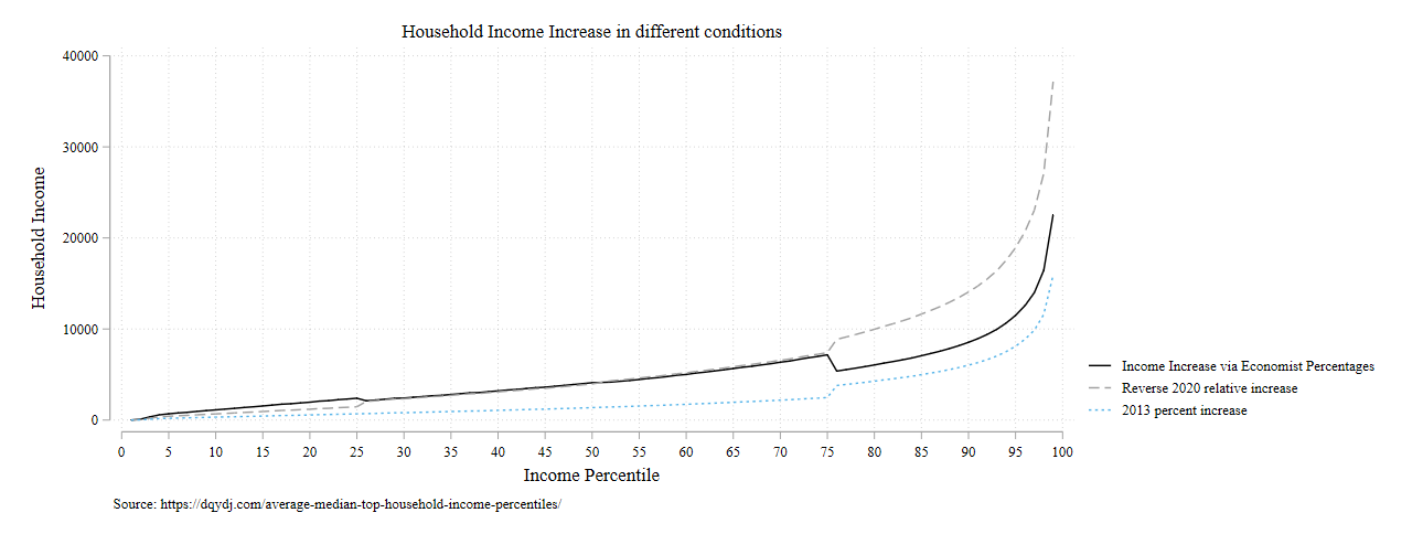
All the action is at the top of the income distribution. I suppose it matters whether there’s an increase of $15k, $25k, or $35k at the very top. But again, we’re looking at very marginal changes at the bottom. Between household differences are the biggest story in every situation.
We can see this as well if we compute Gini coefficients in each of these scenarios:

So there is, like, the most marginal changes at the third decimal place of Gini coefficients. But nothing I’d write home about.
I think Liao makes a valuable point. I’d just follow up that focusing on percentage or relative or logged income differences are great ways to mask the massive between-household differences that exist in our era of very high inequality. I love using logged outcomes in my own research, but I think it’s important to keep an eye on absolute differences to understand the magnitude of the situation we live in.