I just read a great article by Franconeri et al, “The Science of Visual Data Communication: What Works.”
In the article, the authors provide a wide range of advice on how to effectively visualize data. Just about everything in this article is good, and they also cite and suggest many other helpful materials for those hoping to improve their visualizations. But I wanted to highlight one section that slightly bugs me, and to use this as a space to work through my own thinking on the topic. I should say, though, that the overall message of the article’s quite good, and the specific point in this section is also overall correct. So I think they’re, like, 90% of the way there. In this section, they highlight the risks of manipulating the y-axis of a graph:

Top left is a famous example from Huff’s 1954 book, How to Lie with Statistics. Bottom left is an example of National Review trying to disprove climate change (bottom left-left graph. Bottom left-right graph shows actual temp change over time). Right column graphs are real-world examples of worse (top right, Fox News) and better (Economist color-coding climate change) visualizations.
The funny faces in the top left figures highlight the potential manipulation of the y-axis. If you don’t include zero, you can manipulate your readers into thinking a marginal change is a large change. I’m not totally convinced that zero should be included in this example. What are the data in this example? The authors don’t say, and it’s been a long, long time since I’ve read Huff. But this is likely either a country’s GDP or the cost of some policy. When I look across the three graphs, all could be described as manipulative to some degree, including the figure with the zero-value on the y-axis. In my opinion, what is missing in these figures is clear documentation of the author’s goal. For example, the left graph shows that this policy (if that’s what it is) has cost about 20-22 billion dollars per month. Perhaps the goal is to show that this policy has had an extraordinary cost during the year of its implementation. Then, sure, include the zero on the y-axis. The policy’s price is so very far away from nothing! But outside of early 2000s libertarian circles, that’s rarely the reasonable anchoring point. It seems like the graphs would do well with some high-quality comparisons to achieve the author’s goal. Perhaps including change or level of a similar policy, or the same policy in a different country, or the cost of the issue the policy was established to address. So the problem, to me, is that you have some floating information without any meaningful anchoring point. In that case, all visualizations are poor and potentially manipulative.
Similarly, the seemingly nefarious right graph with the distorted face may well be appropriate. I often think that the gut-check call for a zero on the y-axis simply asks graph makers to redraw their graphs in terms of percent change. So then, there would be a natural zero where 20 currently is (0 percent change across months). Then we would see that the policy’s price tag has increased by 10% in only one year. That is a big change! Looking at percent change justifies zooming inon the y-axis to the distorted face. Maybe that’s appropriate, maybe not.
Looking at the climate change graph: I think the zoomed-in figure is obviously the appropriate one. But the authors’ justification is weird and hand-wavey. They argue that zero degrees Farenheit is not an actual meaningful zero, which justifies zooming in. But isn’t that the case for the top-left as well? One can go into debt, after all. Further, there is a meaningful zero in temperature: absolute zero!! So I guess the authors are asking that the graph go to −459.67F? Obviously not. Again, the authors seem to be asking that we look at deviations from typical levels over time, which are better visualized as percent changes, or absolute deviations from long-term averages. So the question of whether the y-axis should include zero or not isn’t the place to direct one’s attention. Rather, in each of these cases, the axis scaling is better answered by a substantive consideration of the author’s goal.
I’ll end by showing the tradeoffs of visualization. Sometimes no good decision exists about how to handle your y-axis, as multiple truths are held in your data simultaneously. Your graphing decisions need to privilege the goals of your research.
I grabbed data from prime-aged men (25-54) from the 2019 American Community Survey. I took two random draws of 500 white and 500 black respondents. Let’s look at their total income earned.
Some social scientists argue, along the lines above, that you should show the range of your observed data. Zooming into things like means distorts what actually occurs within your data (akin to the distorted face on the top-left of the article example). Let’s do that for our income data:

What do you see? Me, I don’t see any meaningful difference in the mass of the data. Just that there are three or four very high earning white men that pull out the y-axis. What if we indicate the mean differences on the graph?
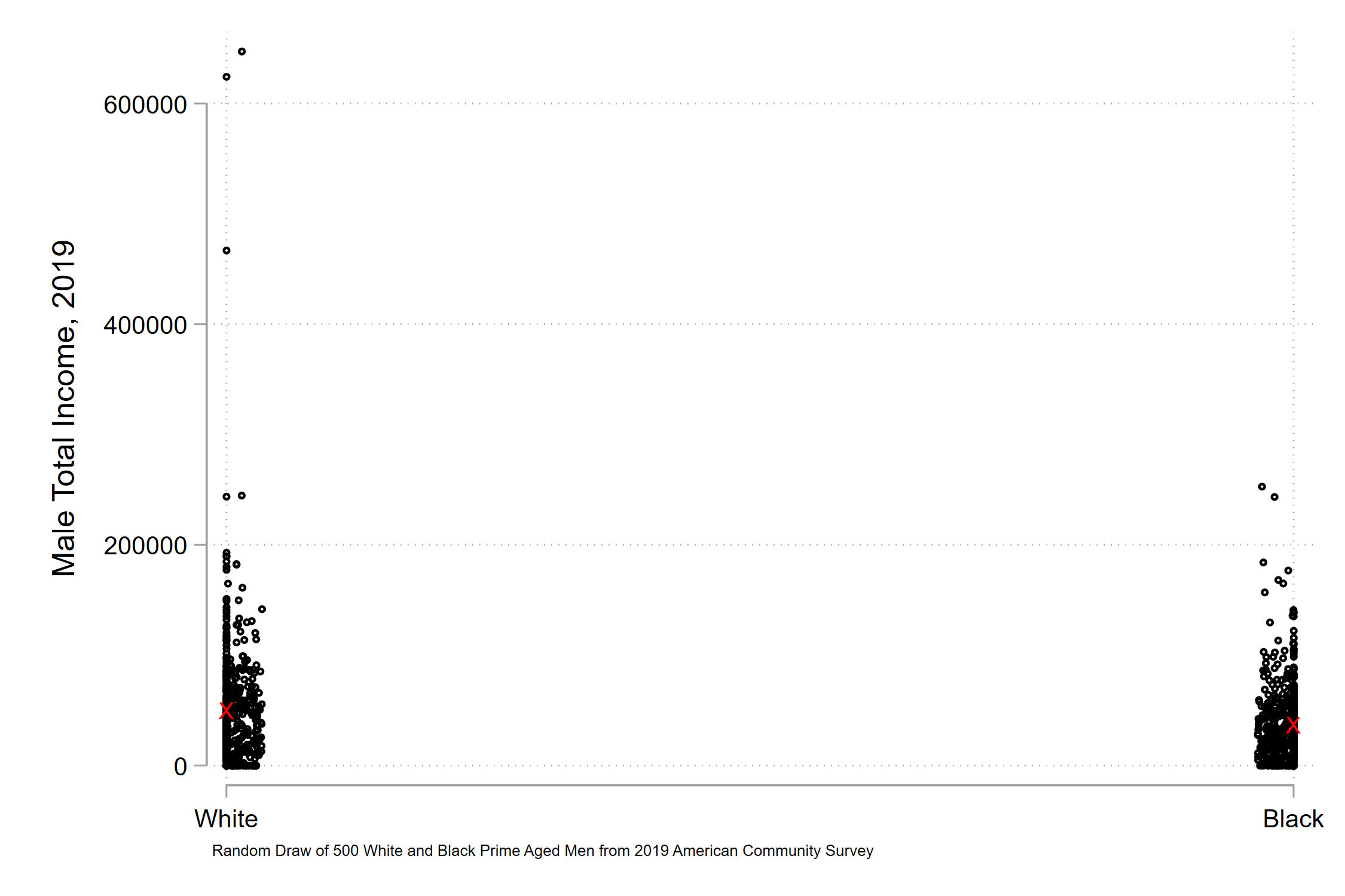
The red X’s indicate white and black mean annual incomes. You see the white x is slightly above the black x, but there’s not too much of a difference.
But obviously, obviously that’s not true. Just the simple average difference of the two is about $12,500. That’s a meaningful difference. So we zoom in, perhaps in a few possible ways. First, paying no mind to a zero-value.

Then, including a zero-value.

When we focus in on the mean difference of the groups, we see large and meaningful racial gaps in earnings. But these coexist with significant within-group income variation. Low earnings aren’t what generates modern income inequality. High earnings are. So maybe top-values of y-axes matter. Let’s scale the y-axis to $250k, roughly the max earning of our black respondents.

There’s no easy resolution. Which of these figures best illustrate racial inequality? I don’t think the raw data is too helpful, as they suggest that the racial income gap is trivial, when it isn’t. But the mean income gap also misses the fact that modern inequality is primarily driven by the separation of very high income earnings, who create functional inequality among those left behind. If we devote our thinking to the zero-value of the y-axis, we risk sloppy thinking about our goals or using data. And resolving issues specifically about the zer0-value of the y-axis risks trampling on the multiple, complex, not fully-resolvable truths in our data.